Why oh Why my Y-Axis, or what part of integer don’t you understand?
I recently met with a customer to discuss their requirements for some new Crystal Reports. In passing, they mentioned a problem they were having with the formatting of the Y-Axis on a chart. The problem was that the chart was being used to display a count, but values was displaying one decimal place which makes no sense as the result is always a round number.
‘No Problem’, I said. Easy work, you just format the number to have no decimal places.
Wrong!
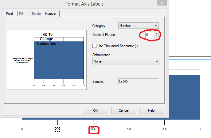
This is what happens when you only have a small count:
As you can see, I’ve selected no decimal places in the chart editor, but that still looks like 0.4 to me. It seems that if there aren’t enough integers to go around, Crystal just displays the decimal places, ignoring the formatting.
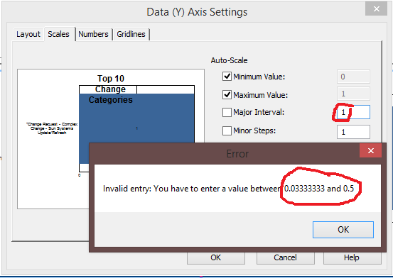
‘No Problem’, I say – I can change the Major Interval to 1 instead of having it set automatically.
Except you can’t:
Crystal forces you to have a minimum of 1 step between minimum and maximum. As I have only 1 in my data, I can’t change this.
Next step was to try and format the chart with a larger date range. Getting closer:
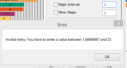
It starts to become more obvious now. you need to get the maximum data point to be a value that will allow you to set the Major Interval to be 1.
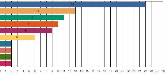
However, there is a gotcha. If you set it with too much data, you get a very busy chart:
This bit can take some experimentation as the value you’re looking for depends upon how many intervals you want displayed and how wide the chart is.
In my report, it was 10. Fortunately, once you’ve managed to persuade Crystal that 1 is the magic number, it starts to behave. I was worried that my chart would have a line for every value even when the maximum was 100+. Crystal seems to understand that you don’t want this and manages to change the interval to 5, 10, 20 etc.
There is one exception. There had to be, life is never this simple.
If your maximum value is just one, you get a phantom line on the chart, the formatting for the max and min changes too:
This is where it gets really odd!
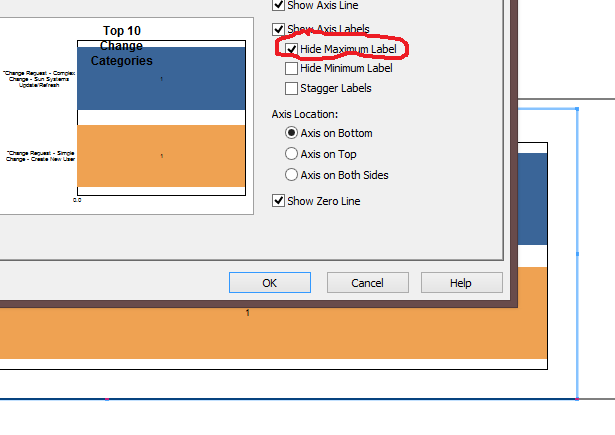
The workaround for this is to turn off the display of the Maximum Label:
Makes no sense to me either! If you don’t like the 0.0 for the minimum, you can turn that off too. Problem now is that a chart without a maximum looks a bit odd. If you want the maximum displaying and you don’t want that phantom line appearing when the maximum is just one, you need to create a second copy of your chart in a separate section and conditionally suppress.
This all drove me nuts, so I hope it helps someone else.

