Sparkline charts in Crystal Reports!
Sadly, the sparklines below no longer work as Google have turned off the charts. Image-charts looked like a good alternative, but they only server the images over https which Crystal still doesn’t support. It’s probably possible to do something clever with a web service, I’ll look if I get the time.
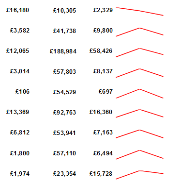
I had an interesting time at a customer site recently. They were converting reports from Excel (ugh) to Crystal Reports. The Excel reports involved multiple queries and took most of a day to generate, so the promise of generating in a few minutes from Crystal Server was very appealing.
Then we realised that the sparkline charts in Excel weren’t supported in Crystal. We tried adding a small chart without any formatting to each group in the report, but it just took up too much space to be practical.
A quick search revealed a Google Chart API. Sadly, it’s now deprecated, but Google are still allowing its use until further notice. There is a more recent replacement, but that needs some fancy JavaScript that Crystal Reports can’t support. Easy enough to create a small web page that returns an image, but one for another day.
The API allows you to create more or less any type of chart by passing parameters on a url. In Crystal Reports, you just add an image where you’d like the chart to appear, then specify it’s ‘Graphic Location’ to display a chart.
You can download the sample report here: Sparklines report
Step by step:
- Take your report
- Add a small image to where you need the chart to be displayed
- Create a formula to generate the image url, first do the formatting values:
- “http://chart.googleapis.com/chart?cht=ls&chs=100×20&chco=FF0000”
- cht=ls is the type of chart (sparkline)
- chs=100×20 is the size of the image
- chco=FF0000 is the colour of the line (red)
- Then add the data values chd=t:10,20,30 This is a static value, use the data in your report to display correctly.
- Display the formula on the report for testing. Copy and paste the value into a browser to see if it works.
- Once it’s working, change the image’s ‘Graphic Location’. Right click the image, select format, then the Picture tab. Set the Graphic Location to be the formula.
In the sample report, you’ll see that I divide the values to be displayed by the largest of the set, then multiply by 100. This is because the default range is 0 to 100 and it’s easier to change the data than the formatting!
Another thing to note is that I’m just passing 3 values in a very laborious way. It would be much better to generate an array, then convert that to a string. I just didn’t want to overcomplicate the report.
Another tip – Google provide a very good ‘play area’ for you to test all the parameters you pass to the chart: Chart Playground
Once you’ve got the hang of Sparklines, you’ll see that you can generate all sorts of other chart types. This is a great way to get around the limitations of Crystal’s chart engine to display charts when the data is only calculated during the final pass through the report.