Using data to improve homecare efficiencies
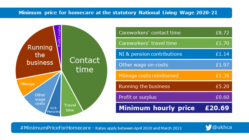
The United Kingdom Homecare Association (UKHCA) published the chart above to calculate the minimum hourly amount that should be charged for care in the home. That tiny purple slice at the top is profit, so any change in costs can make a significant difference to the bottom line.
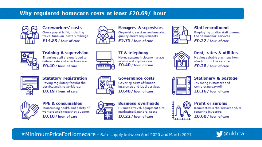
This is then broken down further to give the following (click to view full size):
and
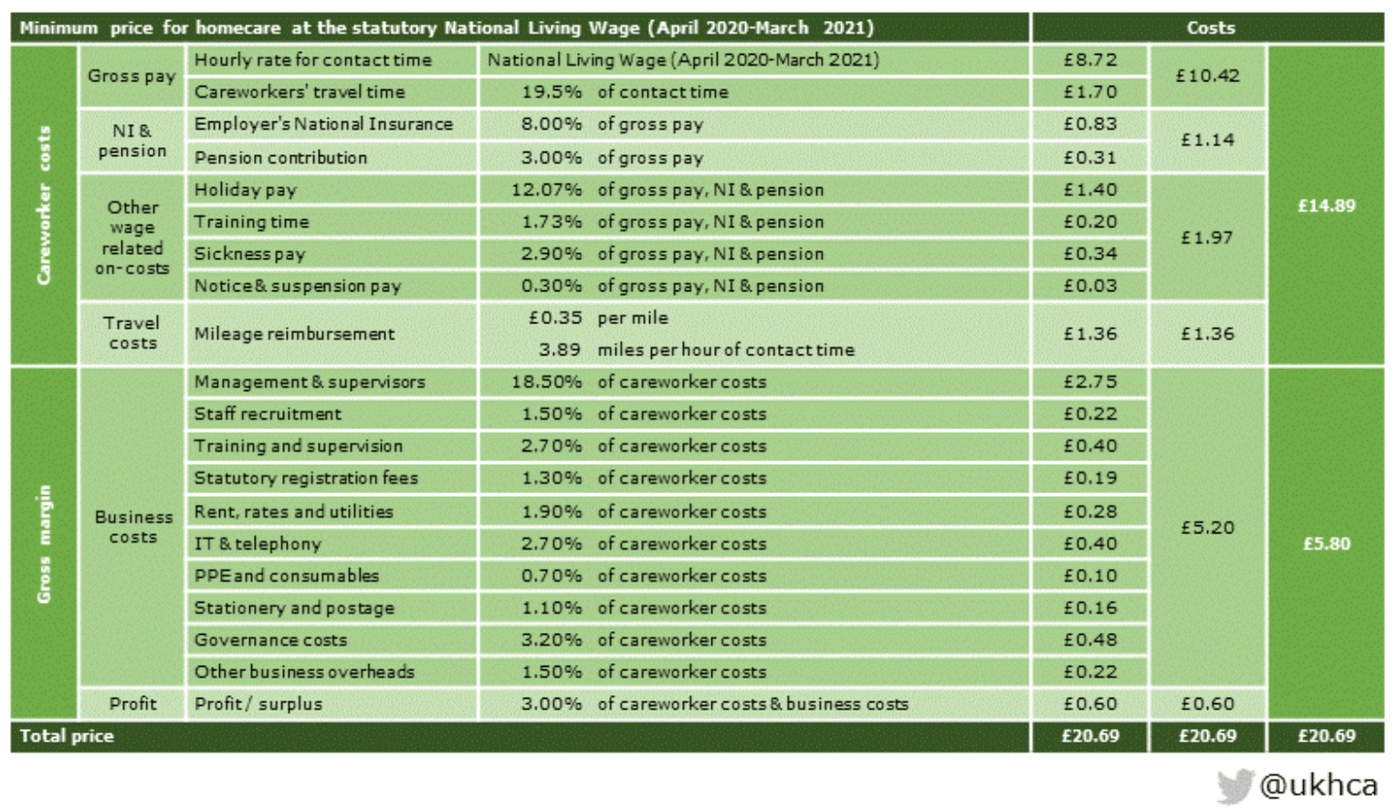
I must admit that calculating your stationery & postage costs as a percentage of employee costs seems a little odd, but the important thing is that we have a breakdown of the categories. Now we can look at how your data can help you reduce your costs. We’re looking at stuff we’ve already done, not stuff we’ve just thought about! We’ll use the same categories, but group them a little differently. The figure in brackets is the percentage of the costs above, excluding the profit.
- Hourly rate for contact time, National Insurance, Pension, Holiday pay etc (57% of total cost)
Sorry, can’t help you there! I’m not about to advocate pay cuts. Don’t get me started on NI rates! - Careworkers’ travel time & Mileage reimbursement (15%)
At first glance, spending nearly 20% of your time travelling may sound excessive. However, imagine having generous 25 minute visits. 19.5% gives you less than 5 minutes travelling time per visit. For a ‘drop-in’ of just 15 minutes, you’re allowed less than 3 minutes. At the moment, that needs to include PPE time too.
We’ve helped care providers by reducing the travel time. An easy quick win is a simple report analysing the interval between regular bookings. This highlights both too much travel time being allowed and too great a distance between bookings.
If you want to be a bit cleverer, the report can be extended to calculate how long it should take to travel between bookings.
One thing to be wary of – we’re looking at caring for vulnerable people, not delivering parcels so continuity of care needs to be considered before rerouting. - Recruitment (1.1%)
What if you could reduce the number of employees who left in their first year by 20%? That’s what we were able to predict using machine learning. That was with no false positives as we used very cautious confidence intervals. With better data, we could do much more. At the moment, this isn’t in use as it generates all sorts of legal HR issues that we’re not qualified to judge, but we’re eager to test further. - Management (14%)
This is the area where efficiencies can lead to the greatest savings. We provide one of our customers with a dashboard that provides summary information in a quickly consumed fashion. Today’s unallocated calls are listed with colour-coding to allow the most urgent to be allocated first. This is integrated with web based text messaging (SMS) to allow available carers to be contacted quickly to redirect. A different view of the data allows Electronic Call Monitoring (ECM) to be monitored in real time.
A suite of reports provides information on Carer Utilisation and comparisons of Actual versus Scheduled care time.
Back on the dashboard, compliance monitoring is simplified with details of outstanding issues with medication, complaints and missed visits.
All this information (and more) should already be in your systems. It just needs a little help to be more useful. - Stationery & postage (0.8%)
It’s not much and it’s not just postage. It also covers the cost of invoicing and payroll. We discovered that one of our customers was having to complete a weekly spreadsheet to provide invoicing information to the local authority. This had to be done on the exact Excel file that the authority provided. It was taking someone half a day per week to enter all the information! With a little automation, we reduced this to about 1 minute per month. That’s a saving of over 2 days per month! - Training and supervision (2%)
There’s some overlap with Management time here, but there’s still time to be saved. We’ve provided reports such as Expiring Training & Overdue Carer Reviews. These help reduce the time spent monitoring carer training requirements. - Sickness (1.7%)
I’m always wary of commenting on sickness as it can generate strong emotions, the CIPD has a good explanation of why we should be monitoring absence. We helped a customer monitor sickness rates using the ‘Bradford Factor’. This simple metric provides a way of measuring sickness without heavily penalising someone who was sick for an extended period of time. It’s very good for quickly identifying anyone who is repeatedly absent for a single day.
There are two great benefits of monitoring sickness. First unauthorised absence is reduced. Secondly, more importantly, sick carers can be supported in their return to work, reducing staff turnover in the process. - Everything else (8.3%)
Most of these are fixed costs. There may be benefits in specific instances of reduced admin time, but we’re not going to make any grand claims of cutting your office rent!
Let’s do some numbers
For the sake of argument, let’s say we can manage the following cost reductions:
- Travel by 10%
- Sickness by 2%
- Management by 10%
- Recruitment by 5%
- Training & Supervision by 5%
- Stationery & Postage by 5%
That’s doubled the profit in the UKHCA’s calculations. In any specific case, some of my calculations will be too optimistic, others too pessimistic, but the important point to note is that small reductions in expenses have a disproportionate impact on profit.
If you’d like to hear more about how we can help, please contact us using the form below.
